Sapphire is not just blue
Sapphire is corundum. Blue is the famous one, but the same mineral occurs in pink, yellow, orange, green, violet and every gradient between — those are all sapphires, correctly described as fancy sapphires. Ruby is the same mineral again, just red enough to earn its own name.
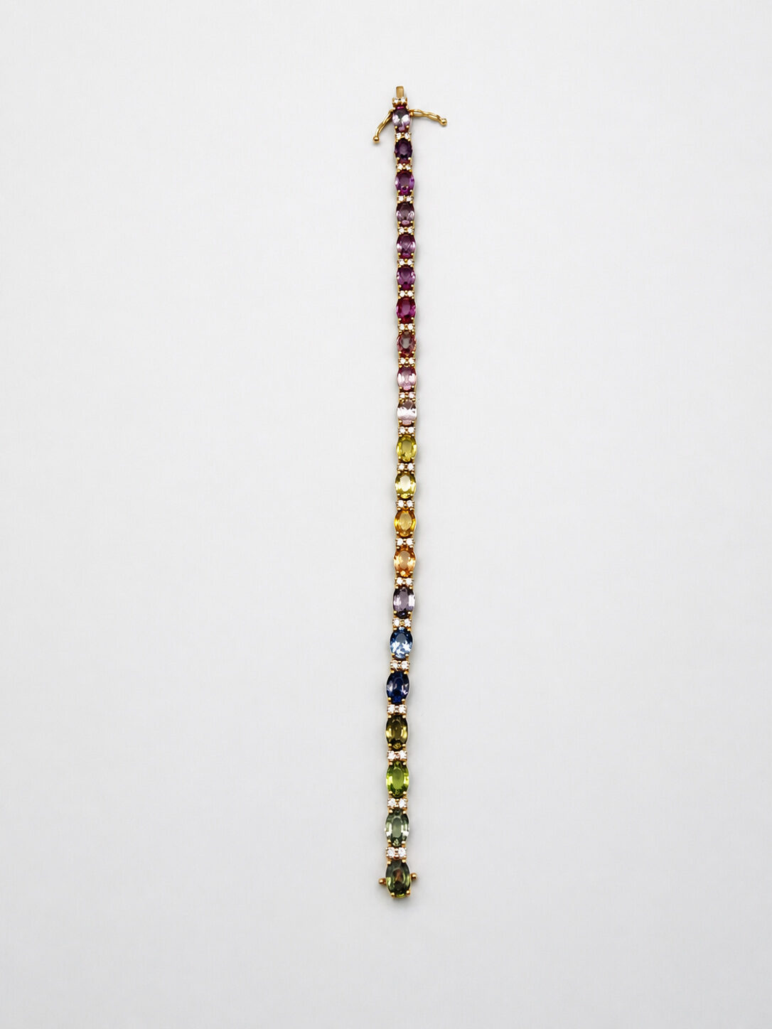
So a rainbow sapphire bracelet is not a mixed-gemstone piece. It is one species of stone across its full colour range, which is why the pieces look coherent rather than like a bag of assorted gems.
Why colour matching is the whole cost
Buying one nice pink sapphire is easy. Buying a pink that sits correctly between the orange to its left and the violet to its right, in the same size, the same cut, and the same saturation, is not. A well-made rainbow bracelet requires sourcing dozens of stones that graduate smoothly, and the sourcing — not the individual stones — is where the money goes.
Look along the bracelet as a whole rather than at any single stone. Does the colour move continuously, or does it jump? A jump means the maker could not find the intermediate stone and shipped it anyway.
Heat treatment, stated plainly
The large majority of sapphire on the market is heat treated, which is a stable, permanent, universally accepted practice that improves colour and clarity. It is not a defect and it does not need hiding. What matters is that it is disclosed, because untreated stones of equivalent appearance cost dramatically more and a buyer is entitled to know which they are getting.
Be much more careful about the other treatments. Diffusion puts colour only into the surface layer, and glass-filling puts leaded glass into fractures — both materially affect value and durability, and both should be stated in writing before you pay.
How the colour reads against different golds
Yellow gold pushes the warm end of the spectrum forward: the oranges, yellows and pinks gain, and the blues and violets sit back. White metal does the reverse, letting the cool end dominate. Neither is more correct, but a rainbow bracelet in yellow gold reads warmer and more vintage, and in white gold reads sharper and more contemporary.
What to inspect
Colour continuity along the whole length. Consistent stone size — variation reads as a compromise. Prongs sitting flat with no lifted corners. And the clasp, which on any tennis-style bracelet should be double-locking with a safety.